This essay does not describe an existing computer program, just one that should exist. This essay is about a suggested student project in Java programming. This essay gives a rough overview of how it might work. I have no source, object, specifications, file layouts or anything else useful to implementing this project. Everything I have prepared to help you is right here.
This project outline is not like the artificial, tidy little problems you are spoon-fed in school, when all the facts you need are included, nothing extraneous is mentioned, the answer is fully specified, along with hints to nudge you toward a single expected canonical solution. This project is much more like the real world of messy problems where it is up to you to fully the define the end point, or a series of ever more difficult versions of this project and research the information yourself to solve them.
Everything I have to say to help you with this project is written below. I am not prepared to help you implement it; or give you any additional materials. I have too many other projects of my own.
Though I am a programmer by profession, I don’t do people’s homework for them. That just robs them of an education.
You have my full permission to implement this project in any way you please and to keep all the profits from your endeavour.
Please do not email me about this project without reading the disclaimer above.
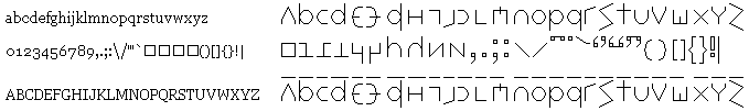
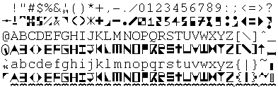
This project requires no coding at all, though to do it well requires considerable artistic ability. Your task is to create a new fixed pitch font specially designed for programmers to use while coding, or for proofreaders to use while proofreading documents.The quick brown fox jumped over the lazy dog’s back.
abcdefghijklmnopqrstuvwxyz
ABCDEFGHIJKLMNOPQRSTUVWXYZ
01234567890
!"#$%&'()*+,-./:;<=>?@[\^_z{|}~
uvw wW gq9 2z 5s il17|!j oO08 `'" ;:,. m nn rn {[()]}
Tiresias PCFont Z, Prima Sans and Prima Sans Monospace are BitStream fonts.
Arial, Lucida Console, Trebuchet MS and Verdana are Microsoft fonts that come bundled with various with their operating systems and word processors.
Much of the text may look fine, but it depends on the font you are using which glyphs will look identical or almost identical. It is often easy to tell the letters apart when you see examples side by side, but it becomes much harder when you see them in isolation. Lucida Console is pretty good except for wW.
In traditional hot lead type, sans-serif fonts are for decorative titles and serif fonts are for body text. Serif fonts are more readable and clear. In computer displays, the serifs just smudge at small resolution, so people choose san-serif fonts for body text. Unfortunately, the computer font designers were not thinking and kept the impractical traditional decorative sans-serif character shapes. They need to be modified to make them more distinctive.
The idea of this project is to radically redesign the letters so they are thoroughly distinct. Such a font might also prove useful for accurate OCR (Optical Character Recognition) work. You don’t want any two letters to be the same except for one tiny dot or squiggle, or differ merely in the degree of roundedness. You want a very open design to that it remains legible at small font sizes and low resolution.
I am after a screen font that will render well at low resolution. This is a different problem from a font that can be printed on low quality paper where you must deal with parts of letters disappearing on you, but where you don’t have a pixelation problem.
Many centuries ago some monks had a similar idea. They needed font you could hand-write quickly and legibly. The came up with what we today call lower case.
Letters that are made of more that one piece such as i, j, : ; ! = % | and " bedevil OCR software, and presumbably the human eye. I thought the new design should make each character contiguous. I also thought you should avoid kerning e.g. nestling the e under the shoulders of the W in Wet. I tended to make all letters the same width, or almost the same width, to make them easier to select by mouse and to reduce the possibiliny of mistaking two narrow letters for one fat one.
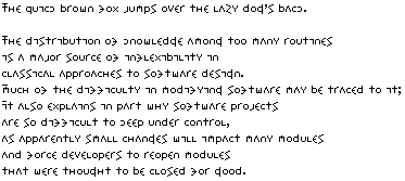
Here is roughly what I had in mind:
I am reasonably happy with it except for the comma-elements (e.g. right double quote and semicolon). They are not distictive enough yet. I think I might give the double sized bulbs as well as a tail. I was limited by what I could do with a pen plotter. A real font would have more filled in characters. The a and n could be more distinct. They suffers the same problem as u and v.
After I did my initial design, I read that people read words by looking at the outlines of entire words. I redid the characters to be distinct in their tops and bottoms, not just left/right and innards.
I tried to avoid tight angles and small enclosed spaces, which tend to fuzz over at small font sizes. I tried to keep the x-height relatively large so that the type would be maximally legible even when packed together tightly vertically.
I tried to make letters distinct with at least two major differences.
The problem is, when I work to make characters distinct, the lack of unifying elements makes the text look like a ransom note. Perhaps some other convention should be used for caps, perhaps colour or weight. I am not a type designer. All I can do is explain what I want, not how to get there.
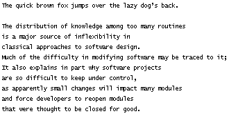
Here is what is looks like in small fuzzy type:
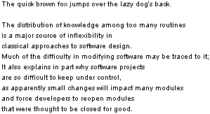
| Font Legibility Comparison | ||
|---|---|---|
| Lucida Console | Proofreader | Arial |
 |
 |
 |
A reader submitted yet another idea of what such a font might look like:
George Bernard Shaw invented a phonetic alphabet for English. Part of his intent was to make the script easy to write with a pencil. The proofreader’s font need not be easy to hand print.
The Mac people have the bit-map pro-font which is like Monaco, but with modifications so you can distinguish all the letters. There are now versions for other platforms.
There are font designing tools to modify or create new fonts, both True Type and PostScript. See Font Creator and Font Lab. The RNIB (Royal National Institute of Blind People) created a font for the visually impaired called Tiresias.
I wonder what a professional font designer would come up with if he designed each character from scratch with proofreading in mind, so that every character had some macroscopic distinctive feature that would not blur at small font sizes. He would be willing to bend the glyphs a little more than unusual to get maximum distinctiveness. Font designers seem willing to warp fonts in extreme ways for decoration, but not for legibility. I have written to dozens of font designers asking them to tackle this project. So far none have expressed any interest in doing it, though one font company did agree there was a need for such a font.
A group of proofreaders designed their own proofreading font called DPCustomMono2 with letters that are easy to distinguish, with relatively conventional shapes. It is designed to be anti-aliased. If you use it without anti-aliasing, it looks rather flea-bitten.
Another way of approaching this is not letter-shapes, but word-shapes. How do you arrange that entire words have distict shapes?
This page is posted |
http://mindprod.com/project/proofreaderfont.html | |
Optional Replicator mirror
|
J:\mindprod\project\proofreaderfont.html | |
Please read the feedback from other visitors,
or send your own feedback about the site. Contact Roedy. Please feel free to link to this page without explicit permission. | ||
| Canadian
Mind
Products
IP:[65.110.21.43] Your face IP:[216.73.217.34] |
| |
| Feedback |
You are visitor number | |