 CSS
CSSThe limitations of CSS include:
<span style="font-variant:small-caps;font-family:'Tiresias PCFont Z'">
This will show up in small caps.</span>
When you use embedded styles, you must use ' instead of " e.g.
<span class="frog">…</span>Note the there is no dot before frog when you used the tag, just when you define it.
CSS units of measure have to taken with a large grain of salt. Browsers have zoom features which can magnify or shrink. Printers have variable resolution. Tiny screens can now have as many dots as desktop screens. It is wise experiment with the various browsers, printers, devices, OSes to see the final effects. As a rule of thumb, avoid absolute units like px, pt, cm and inch as much as possible and use % or em.
| CSS Units of Measure | ||
|---|---|---|
| Unit | Meaning | Notes |
| px | pixels | I found that a 20px font in CSS is not the same size as one in Java, even with the same font face. |
| pt | points | Nominally one PostScript point. Postscript points are 1/72 inch. Printer points are 1/72.2 inch. Java points are 1 pixel. You really have to experiment to see the effect. |
| em | m widths | Usually used to defined font sizes. 2em means twice the size of the current font. Think of it as a size multiplier having nothing to do with printer ems. |
| % | percentage | 100% does nothing. 110% makes an element/font 10% bigger than it would normally be. |
| cm | cm | Even though this is nominally an absolute unit, it will rarely result is exactly 1 centimeter on screen or on the printed page. |
| mm | mm | Even though this is nominally an absolute unit, it will rarely result is exactly 1 millimeter on screen or on the printed page. |
| in | inch | Even though this is nominally an absolute unit, it will rarely result is exactly 1 inch on screen or on the printed page. |
| ex | x-height | height of the letter x in a font. Usually about half the font height. I don’t know how this is intended to be used. Perhaps it is for scaling margins. |
| pc | picas | 12 points. 1/6 inch. There are five different definitions for pica in typesetting. |
<table class="gridmenu">
and all the text in the table will use those defaults. You no longer use any of the traditional HTML tags in your <table commands such border=0 cellpadding=4 cellspacing=4.
To control the outer perimeter of the table you attach styles to table.gridmenu. To control the perimeter of the individual cells, you attach cells to table.gridmenu td.
You can define styles based on context, e.g. how a td renders differently inside a table or inside two or three levels of table. You can specify every imaginable combination of styles of the nestings.
Make sure you have all the combinations defined that you need.
When doing markup in your HTML documents, you could write either <td><span class=x> or <td class=x>. The second is preferable because:
Unfortunately, CSS officially supports only the 16 HTML 3.2 colour names. Of course, you can use the #ffffff style specifiers, to get any of the 16,777,216 possible colours.
Click any ball to view the corresponding colour palette.
| Named Colours |  |
Alphabetically (140) | |
BHS: by Brightness, Hue, Saturation | |
HBS: by Hue, Brightness, Saturation | |
SBH: by Saturation, Brightness, Hue | |
Java AWT Colours (16,777,216) |
|---|---|---|---|---|---|---|---|---|---|---|
|
RGB: Numerically (140) | |
BSH: by Brightness, Saturation, Hue | |
HSB: by Hue, Saturation, Brightness | |
SHB: by Saturation, Hue, Brightness | |
Java Swing Colours (16,777,216) | |
| Numbered Colours | |
HTML 3.2 (16) | |
Websafe (216) | |
Rainbow (4096) | |
Spectrum (401) | |
X11 (657) |
| Selected Colours | |
Pale (256) | |
Dark (2022) | |
Simple (105) | |
Greys (256) | |
Colour Schemes |
Look for websites that display this logo
 and study their html and their style sheets to learn how these tools are used in practised. I switched over the
mindprod.com site over to use them. You can specify styles that only take effect
under special nested conditions. You can override styles with more styles or with ordinary
HTML tags. There are currently two
CSS standards, CSS1 and CSS2. CSS2 has many
more features, including the ability to specify different styles for display on screen and for printing. It also
allows you to include fonts with your document.
and study their html and their style sheets to learn how these tools are used in practised. I switched over the
mindprod.com site over to use them. You can specify styles that only take effect
under special nested conditions. You can override styles with more styles or with ordinary
HTML tags. There are currently two
CSS standards, CSS1 and CSS2. CSS2 has many
more features, including the ability to specify different styles for display on screen and for printing. It also
allows you to include fonts with your document.
CSS is actually much easier to learn and much less work to apply than the old system. The philosophy is different. You don’t mix your style and text information. You put all your style thoughts in one place to be globally applied. You mark up your text with what flavour of thing each chunk of text is, not how it is to be painted. The biggest problem is you can make syntax errors and nothing complains and nothing happens, e. g. it is color not foreground-colour. It is margin-left: 100px not left-margin: 100 px, font-size: 125% not size: +25%, padding-top: 6pt not top-padding: 6 pt.
// example of how you might attach font attributes to a tagging class.

.bushsaid  {
        background: transparent;
        color: #552500 /* dark brown*/;
        font-family: "Lucida Console",courier,"courier new",monospace;
        font-style: italic;
        font-weight: bold;
}
transparent means whatever the text is draw over, its shows through in the background. inherit means the background colour comes from the enclosing tag.
Multi-column layouts are not yet officially part of CSS, but there is a working proposal for how to do them. Multi-column layouts work with Chrome, Firefox and Safari. They partially work on SeaMonkey (no vertical bars). They do not yet work Opera, IE (Internet Explorer) or Avant. With them, you just get a single column — not the end of the world. Last revised/verified: 2009-09-05. Normally you set them up so that people with wide screens see several columns and people with narrow screens see only one. You can optionally separate the columns with a vertical rule. As the user grows and shrinks the HTML display window, extra columns rapidly appear and disappear. The Spec is unusually easy to understand. Here are the basics:
This feature is not quite ready for prime time. If any element is wider than one column, it overlays the next column. CSS also need an attribute to avoid stringing three columns across with only one line in them.
You can apply a style containing width:200px, width:50%, min-width:200px or max-width:200px to a td to control its width. However, browsers are buggy and often ignore your commands. Sometimes you can get to work by using both min-width and width.
You can also get multi-column effects without using tables. You use properties like this: column-count:3, -webkit-column-count:3, -moz-column-count:3, column-width:200px, -webkit-column-width:200px, -moz-column-width:200px, column-gap:20px, -webkit-column-gap:20px and -moz-column-gap:20px. The advantage of this scheme is text automatically reflows between columns. You don’t have to decide the column breaks manually as you do with tables. -moz is for older versions of Firefox and Sea Monkey. -webkit is for older versions of Chrome, Opera and Safari.
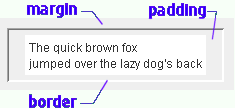
It is very easy to reverse padding and margin and then be baffled at the results. Here is another way to help keep them straight. Think of the border as like a shipping box. The padding is like the bubble pack use to pad the contents for shipment, on the inside of the box. Think of a book with a box around the text, then margins are the clear area around the box. Here is one more mnemonic. Thing about the people who live on the margins of society. They are on the most outside.
Working from the inside out:
If you don’t have a border ruling line around the item, or a matte, just ignore the border and margin and use the padding fields.
| CSS Padding and Border | Java Insets | ||||||||||||||||||
|---|---|---|---|---|---|---|---|---|---|---|---|---|---|---|---|---|---|---|---|
|
| ||||||||||||||||||
| Beware, the CSS border and padding
specifications are ordered clockwise:
top, right, bottom, left. You can help remember this by thinking CSS and clockwise both begin with C. |
Java Insets, in contrast, are ordered counter clockwise:
top, left, bottom, right |
To adjust margins and padding you need to measure how far off they are. This is most easily done with a virtual ruler. If you just guess, you can spin your wheels for hours.
What happens when you have a margin around an element? Is the margin ignored or is the box indented when it occurs at the start of a line. Let’s find out:
box with 10px padding and 20px border
Oddly, the additional margin is honoured on the left, with the border indented 20px, but not on the top and bottom. What happens when two such boxes butt against each other. Is the margin considered a minimum approach distance where the separation would be 20px, or an inviolate additive force field where the distance is the sum, namely 40px? Let’s find out:
box with 10px padding and 20px borderanother box with 10px padding and 20px border
The margins are additive, the borders are separated by 40px.
Once you have the body of the paragraph in position as you want it, you can adjust the first line indenting it with a positive text-indent or outdenting it with a negative text-indent.
/* text decoration */

.nounderline { text-decoration : none /* get rid of underline */; }

.underline { text-decoration : underline /* underline */; }
Note the asymmetry in the ways of handling horizontal vs vertical alignment. See examples of what the various alignments should look like. See also float, which is what you use most often for horizontal alignment.
You can align your text (and embedded images) horizontally with:
Experiment!You can align elements vertically with:
Experiment!| Possible values for the CSS position property | |
|---|---|
| position:static; | default positioning |
| position:relative; | relative to where the text would normally appear, controlled by the independent top, right, bottom and left properties which can be specified in various units including pixels, ems and percentages. Note, you don’t specify the offsets on the position property. They are specified on their own independent properties. |
| position:absolute; | means relative to the top left corner of the enclosing element. |
| position:fixed; | relative to the top left corner of the screen. For example, fixed is used for headings that don’t scroll while the rest of the document does. Use these in conjunction with width, height, min-width and min-height properties for many different effects. |
| position:auto; | asks the browser to compute the value so that the other properties are satisfied. |
float:left; float:right; and float:none; are yet another positioning tool. They do extreme positioning.
These tools let you rearrange text, so that it renders in a completely different order. For example, you can embed a span tag in a paragraph that puts a marker to the left of the beginning of the paragraph.
You can also do things like put the text to load an ad last on the page, but use absolute positioning to place it near the top of the page, effectively letting you design in layers. That way it will the lowest priority for rendering, but still be at the top of the page.
There is the related background-position: property, which can be contracted into the background: property. Default value: 0% 0% (x% y%). The first value is the horizontal position and the second value is the vertical. The top left corner is 0% 0%. The right bottom corner is 100% 100%. If you only specify one value, the other value will be 50%.
For integers 0,0, the first value is the horizontal position and the second value is the vertical. The top left corner is 0, 0. Units can be pixels (0px 0px) or any other CSS units. 0 must be written without units. All other values must have a unit. If you leave the unit out, you won’t get an error message. Your property will most likely be ignored.
With percentages or integers you specify x first then y, but when you use words like center and left you normally specify the y positioner word before the x positioner, e.g. center left, as all the examples are shown. However, the W3C (World Wide Web Consortium) spec says order should not matter. Note also that center, not middle, is used for the y positioner to be consistent with the align tag.
The background-position property can have values like this:
| Possible values for the CSS background-position property | |||
|---|---|---|---|
| Position | Appearance on Cell | Appearance on Unpadded Text | Notes |
| background-position:top left; | style on cell <td | style on text <span | background image upper left corner aligns with upper left corner of the box. Note you specify the y positioner before the x positioner when you use words. |
| background-position:top center; | style on cell <td | style on text <span | background image is aligned with the top and centred. |
| background-position:top right; | style on cell <td | style on text <span | upper right |
| background-position: center left; | style on cell <td | style on text <span | middle left |
| background-position:center center; | style on cell <td | style on text <span | centred |
| background-position: center right; | style on cell <td | style on text <span | middle right |
| background-position:bottom left; | style on cell <td | style on text <span | bottom left |
| background-position:bottom center; | style on cell <td | style on text <span | bottom centre |
| background-position:bottom right; | style on cell <td | style on text <span | bottom right |
| background-position:0% 100%; | style on cell <td | style on text <span | order x, y. 0% means the upper left corner of the background image is positioned as far left or as far up as possible. 100% means as far right or as far down as possible. 50% in the middle. I have not experimented with numbers less than 0 or greater than 100. Don’t mix % with word values. |
| background-position:20px 10px; | style on cell <td | style on text <span | background image is positioned 5px to right of normal position and 10px down. |
| background-position:-10px -5px; | style on cell <td | style on text <span | background image is positioned 5px to left of normal position and 10px up. |
There are four problems to solve when you use background images.
Unfortunately CSS just lets you place just one image per element.
 The best browser for
CSS
is Opera. Opera is relatively bug free in CSS and is faster that IE, but not all plug-ins
work with it and it has bugs in forms and JavaScript. You might consider using Opera
to get your CSS working, then switch over to dodge the
bugs in the other browsers.
The best browser for
CSS
is Opera. Opera is relatively bug free in CSS and is faster that IE, but not all plug-ins
work with it and it has bugs in forms and JavaScript. You might consider using Opera
to get your CSS working, then switch over to dodge the
bugs in the other browsers.
<meta http-equiv=Content-Type content="text/html; charset=iso-8859-3">
Other bugs are it ignores min-height.
Beware of background-color: inherit. It is not well supported and can lead no strange behaviour like non-repeating elements that repeat just once.
All the major browsers ignore <col class= and all but opera ignore <col align=. Last revised/verified: 2007-04-27
The Web Standards Acid test for CSS shows Opera to be perfectly in compliance. SeaMonkey, with minor problems, Firefox with serious problems and IE as hopeless.
You should apply styles about intercell spacing to the table, but styles about the margins and borders of an individual cell to the td. tds will not inherit such styles from the table or tr.
Selector span.frog
<td><span class="frog">some text</span></td>is a quite different animal from selector td.frog
<td class="frog">some text</td>even when the span is inside a td.
Some styles will inherit, e.g. font-face, which will provide the default for td if applied to the enclosing table.
When I refer to an image in a style sheet e.g.
TopStyle is a program that lets you edit style sheets. It mainly just lists all the possible attributes and lets you fill in the ones you want for each style. You soon discover there are hundreds of possible attributes you can apply to a style. Further, you discover, that unlike HTML, you can apply any attribute to any tag, even tags like <a, <img and <applet. This makes CSS much more flexible than HTML.
You can, for example, fudge the way text and images align vertically together with the vertical-align attribute. You can add that to any style.
Don’t worry too much about understanding what all the style attributes mean. If you see something promising, try setting the attribute to all of its allowed values and look at the results. You will figure it out much faster than if you try to make sense of the lawyerly W3C specification prose. The trick is finding likely candidates in the overwhelming sea of possibilities and remembering to try them at the table, row and cell level to see the varying effects.
The other thing to keep in mind is you must be brave and try out unlikely combinations. Coming from a standard HTML background, you may be too timid to try attributes you have traditionally associated with only one tag on another.
The orthogonality is most clear when you see the definitions of all the selectors in the W3C default CSS style sheet (which browsers don’t necessarily use.) You can see how the special behaviour of each tag is created simply by assigning the tag standard properties.
Sometimes this orthogonality will get you in trouble. For example, the bullets in unordered lists are, under-the-hood, really just a specialised background image. You may confuse your browser if you try to use both a background image and a bullet (or bullet image) on the same block of text.
The precedence goes like this:
| CSS Selector Examples | |
|---|---|
| Example | Meaning |
| td | means this rule applies to the contents between any <td>… </td> |
| .strawberry | means this rule applies to anything marked with class=strawberry |
| td ul | means this rule applies to any <ul> nested inside a <td>, nested at any depth. Beware of ul li This would also apply to a li deeply nested inside an ol. |
| td>ul | means this rule applies to any <ul> immediately nested inside a <td>, in other words, a child. |
| td.strawberry | means this rule applies to any <td class=strawberry>. |
| p + table | means this rule applies to any <table … </table> preceded by a <p> … </p>. I don’t know of any selector to modify a tag followed by some marker tag. |
| div * li | means this rules applies only to a <li> at least grandchild levels deep inside the <div>. If it is a direct child, it does not count. |
| a.button:link | means use this rule for unvisited links coded with <a class=button href=… |
| a.button:visited | means use this rule for visited links coded with <a class=button href=… |
| a.button:active | means use this rule for active links coded with <a class=button href=… An active link is the one you just clicked. |
| a.button:hover | means use this rule for the link the cursor is hovering over with <a class=button href=… |
| a[href] | means use this rule for any <a href=xx> text </a> |
| table.strawberry td a:link | Means this rule only applies to unvisited links inside <td> inside
tables with class=strawberry. Just plain
table.strawberry a:link will not work because the links are not immediately
inside the <table> but nested a level deeper inside <td> tags. You might use this selector to turn off underlining by combining it
with this rule:
{
/* turn off underline */ text-decoration : none; } |
| table.strawberry td a:visited img | Means this rule only applies to visited <img links inside <td> inside tables with class=strawberry. You might use this selector to turn off the red/blue box around an image
link by combining it with this rule:
{
/* turn off border around image */ border : none; } |
| li>p:first-child | Means this rule applies only to the very first <p> inside an
<li>. There must be nothing between the <li> and the <p>, not even an anchor or plain
text. Combine it with this rule:
{
/* remove excess leading on first paragraph in any li */ top-margin : 0; top-padding : 0; } |
| p:first-line | Means this rule applies only to the very first line in a paragraph. |
| .timemark:before | Used to insert standard content before the field. Combine it with this rule:
{
/* add word "time" before class="timemark" fields.*/ content: "time:"; } |
| .timemark:after | Used to insert standard content after the field. Combine it with this rule:
{
/* add word "UTC" after class="timemark" fields.*/ content: " UTC"; } |
Here is a basic drop cap:
/* markup to use this rule: <p class="fancy">Here is a basic drop cap:</p> */
p.fancy:first-letter {
  font-size:200%;
  vertical-align:-.4em;
}
There is a related pseudo-element to :first-letter called :first-line and another called ::selection.
You can mark particular places in your code with the id tag. e.g.
<!-- example of use of id -->

Jump to <a class="onpage" href="#BOOKS">Books</a> section.
...

<h2 id="BOOKS">Books</h2>
Its most common purpose is to provide a target for page-internal links. ids must be unique on a page. My personal convention is to always make them upper case, but that is not required. They are case-sensitive. They may not start with a digit. My convention is to prefix an X when they naturally start with a digit.
However, you can also use ids in CSS, most commonly in inline styles to make a style apply only to a single instance, the element tagged with the specified id. h2#BOOKS { color:green; } would apply only to an <h2 tag with an id of BOOKS.
| Tool | Cost
|
Notes |
|---|---|---|
| Rapid CSS | Has a trial. Has nice spell checker. Seems to be an ordinary text editor with syntax highlighting. Works much like TopStyle, with an even more convenient layout. You can jump to style on in the left panel and change its fields on the right and see the text in the middle. Crashed every time I attempted to use the internal preview panel. The preview in a browser works once you configure your browser locations. | |
| CSS edit | I have never used it. Has a trial. For the mac. | |
| Overzone Style Studio | It failed to install on Windows Vista. The author said he is working on a Vista-compatible version. Has a trial. Now discontinued. | |
| StyleMaster | Has a trial demo. It has the 3-windows layout where you select the style on the left, see the text on the right and edit with dialogs on the left. It crashed when I tried the validator. It previews using various web browsers you can configure. It does at tiny bit of previewing e.g. colour and font in the left window style selector. It will scan your site to look for orphan (unused) styles. The scan is quite slow compared with TopStyle. It failed to display the results. It uses an external web validator. It has a convenient help window to find out about all the css keywords. With the menu or with keystrokes you can invoke all manner of mini-editors. The help is implemented as HTML displayed in a spawned browser, so it is slow to start and without the usual search features. Has both a Windows and Mac version. | |
| TopStyle | What I use now. The new management are much more responsive than the previous owners. |
Note how you can’t use ordinary html &entities in the content. You must use CSS ’s scheme, different from C, Java and HTML. Instead of using entities in content, you can use \" for double quote, or \nnnn hex codes. To get left quote, use open-quote. To get right quote use close-quote.
There are all kinds of variations. Google for css content to learn more about before: after: and content:.
 W3C HTML Validator: works online and is free for validating
HTML.
W3C HTML Validator: works online and is free for validating
HTML. W3C CSS Validator: works online and is free for validating
CSS
style sheets.
W3C CSS Validator: works online and is free for validating
CSS
style sheets.when you choose a bigger font-size you automatically get a larger interline spacing, line-height. Even when there is only one line you will automatically get more vertical space before and after.
Even when there is no bug, there is no way grabbing the browser by the shoulders and saying why did you do that? CSS is inscrutable.
Then you use an ordinary browser to view sample web page that use your CSS. You can modify the CSS, save the CSS and reload the HTML to see the page with an improved style sheet. Sometimes it helps to experiment, putting in large values for CSS fields so you can see the visual effect of various parameters. For fine tuning, use a pixel ruler to measure precisely how many pixels you want to tweak the output.
If things still don’t look as you expect, use Firefox and inspect the element. This will show you how your various lines in the CSS style sheet override each other to produce the final result.
 |
recommend book⇒CSS3: Visual QuickStart Guide, 6th Edition | |||||||||||||||||||||||||||||||||||||||||||||||||||||||
| by | Jason Cranford Teague | 978-0-321-88893-8 | paperback | |||||||||||||||||||||||||||||||||||||||||||||||||||||
|---|---|---|---|---|---|---|---|---|---|---|---|---|---|---|---|---|---|---|---|---|---|---|---|---|---|---|---|---|---|---|---|---|---|---|---|---|---|---|---|---|---|---|---|---|---|---|---|---|---|---|---|---|---|---|---|---|
| publisher | Peachpit Press | 978-0-13-313275-5 | eBook | |||||||||||||||||||||||||||||||||||||||||||||||||||||
| published | 2012-11-25 | 978-0-13-313276-2 | WebBook | |||||||||||||||||||||||||||||||||||||||||||||||||||||
| B00A8SCTS0 | kindle | |||||||||||||||||||||||||||||||||||||||||||||||||||||||
| Covers both CSS2 and CSS3. Each chapter is independent. You don’t have to read through from cover to cover. | ||||||||||||||||||||||||||||||||||||||||||||||||||||||||
| ||||||||||||||||||||||||||||||||||||||||||||||||||||||||
| Greyed out stores probably do not have the item in stock. Try looking for it with a bookfinder. | ||||||||||||||||||||||||||||||||||||||||||||||||||||||||
 |
recommend book⇒Sergey’s HTML5 & CSS3: Quick Reference. HTML5, CSS3 and APIs. Full Color, second edition | |||||||||||||||||||||||||||||||||||||||||||||||||||||||
| by | Sergey Mavrody | 978-0-9833867-2-8 | paperback | |||||||||||||||||||||||||||||||||||||||||||||||||||||
|---|---|---|---|---|---|---|---|---|---|---|---|---|---|---|---|---|---|---|---|---|---|---|---|---|---|---|---|---|---|---|---|---|---|---|---|---|---|---|---|---|---|---|---|---|---|---|---|---|---|---|---|---|---|---|---|---|
| publisher | Belisso | B00852KP6Y | kindle | |||||||||||||||||||||||||||||||||||||||||||||||||||||
| published | 2012-03-28 | |||||||||||||||||||||||||||||||||||||||||||||||||||||||
| ||||||||||||||||||||||||||||||||||||||||||||||||||||||||
| Greyed out stores probably do not have the item in stock. Try looking for it with a bookfinder. | ||||||||||||||||||||||||||||||||||||||||||||||||||||||||
 |
recommend book⇒Beginning CSS: Cascading Style Sheets for Web Design, third edition | |||||||||||||||||||||||||||||||||||||||||||||||||||||||
| by | Ian Pouncey, Richard York | 978-0-470-89152-0 | paperback | |||||||||||||||||||||||||||||||||||||||||||||||||||||
|---|---|---|---|---|---|---|---|---|---|---|---|---|---|---|---|---|---|---|---|---|---|---|---|---|---|---|---|---|---|---|---|---|---|---|---|---|---|---|---|---|---|---|---|---|---|---|---|---|---|---|---|---|---|---|---|---|
| publisher | Wrox | 978-1-118-12178-8 | eBook | |||||||||||||||||||||||||||||||||||||||||||||||||||||
| published | 2011-06-28 | B0055AXSAY | kindle | |||||||||||||||||||||||||||||||||||||||||||||||||||||
| Beginner’s book that teaches by examples. A full colour book, which makes sense since CSS is so much about getting colours right. | ||||||||||||||||||||||||||||||||||||||||||||||||||||||||
| ||||||||||||||||||||||||||||||||||||||||||||||||||||||||
| Greyed out stores probably do not have the item in stock. Try looking for it with a bookfinder. | ||||||||||||||||||||||||||||||||||||||||||||||||||||||||
 |
recommend book⇒The Book of CSS3: A Developer’s Guide to the Future of Web Design | |||||||||||||||||||||||||||||||||||||||||||||||||||||||
| by | Peter Gasston | 978-1-59327-286-9 | paperback | |||||||||||||||||||||||||||||||||||||||||||||||||||||
|---|---|---|---|---|---|---|---|---|---|---|---|---|---|---|---|---|---|---|---|---|---|---|---|---|---|---|---|---|---|---|---|---|---|---|---|---|---|---|---|---|---|---|---|---|---|---|---|---|---|---|---|---|---|---|---|---|
| publisher | No Starch | 978-1-59327-363-7 | eBook | |||||||||||||||||||||||||||||||||||||||||||||||||||||
| published | 2011-05-13 | B005011IU0 | kindle | |||||||||||||||||||||||||||||||||||||||||||||||||||||
| Non-technical. Focuses on how to snazz up websites. | ||||||||||||||||||||||||||||||||||||||||||||||||||||||||
| ||||||||||||||||||||||||||||||||||||||||||||||||||||||||
| Greyed out stores probably do not have the item in stock. Try looking for it with a bookfinder. | ||||||||||||||||||||||||||||||||||||||||||||||||||||||||
 |
recommend book⇒CSS Cookbook, third edition | |||||||||||||||||||||||||||||||||||||||||||||||||||||||
| by | Christopher Schmitt | 978-0-596-15593-3 | paperback | |||||||||||||||||||||||||||||||||||||||||||||||||||||
|---|---|---|---|---|---|---|---|---|---|---|---|---|---|---|---|---|---|---|---|---|---|---|---|---|---|---|---|---|---|---|---|---|---|---|---|---|---|---|---|---|---|---|---|---|---|---|---|---|---|---|---|---|---|---|---|---|
| publisher | O’Reilly  |
978-1-4493-8294-0 | eBook | |||||||||||||||||||||||||||||||||||||||||||||||||||||
| published | 2009-12-31 | B0043D2DMS | kindle | |||||||||||||||||||||||||||||||||||||||||||||||||||||
| Most people learn most easily from looking at working examples with some explanation and not too much theory. | ||||||||||||||||||||||||||||||||||||||||||||||||||||||||
| ||||||||||||||||||||||||||||||||||||||||||||||||||||||||
| Greyed out stores probably do not have the item in stock. Try looking for it with a bookfinder. | ||||||||||||||||||||||||||||||||||||||||||||||||||||||||
 |
recommend book⇒Web Standards Solutions: The Markup and Style Handbook, Special Edition | |||||||||||||||||||||||||||||||||||||||||||||||||||||||
| by | Dan Cederholm | 978-1-4302-1920-0 | paperback | |||||||||||||||||||||||||||||||||||||||||||||||||||||
|---|---|---|---|---|---|---|---|---|---|---|---|---|---|---|---|---|---|---|---|---|---|---|---|---|---|---|---|---|---|---|---|---|---|---|---|---|---|---|---|---|---|---|---|---|---|---|---|---|---|---|---|---|---|---|---|---|
| publisher | Friends of ED | 978-1-4302-1089-4 | eBook | |||||||||||||||||||||||||||||||||||||||||||||||||||||
| published | 2009-05-07 | B00292BEVG | kindle | |||||||||||||||||||||||||||||||||||||||||||||||||||||
| Handles both HTML and CSS focusing on following standards to keep the web tidy. | ||||||||||||||||||||||||||||||||||||||||||||||||||||||||
| ||||||||||||||||||||||||||||||||||||||||||||||||||||||||
| Greyed out stores probably do not have the item in stock. Try looking for it with a bookfinder. | ||||||||||||||||||||||||||||||||||||||||||||||||||||||||
 |
recommend book⇒CSS: The Definitive Guide, third edition | |||||||||||||||||||||||||||||||||||||||||||||||||||||||
| by | Eric A. Meyer | 978-0-596-52733-4 | paperback | |||||||||||||||||||||||||||||||||||||||||||||||||||||
|---|---|---|---|---|---|---|---|---|---|---|---|---|---|---|---|---|---|---|---|---|---|---|---|---|---|---|---|---|---|---|---|---|---|---|---|---|---|---|---|---|---|---|---|---|---|---|---|---|---|---|---|---|---|---|---|---|
| publisher | O’Reilly |
978-0-9802858-5-7 | hardcover | |||||||||||||||||||||||||||||||||||||||||||||||||||||
| published | 2006-11-14 | 978-1-4493-9725-8 | eBook | |||||||||||||||||||||||||||||||||||||||||||||||||||||
| B00457X7L8 | kindle | |||||||||||||||||||||||||||||||||||||||||||||||||||||||
| Also covers faulty and spotty browser support to help you deal with compatibility issues. Make sure you get the second edition. The first was published in 2000 and is highly concerned with limitations of browsers of that time. The problem with this book is it belabours the obvious. You wade through pages and pages of dummy-level repetitive explanation, to find the nuggets of the unexpected which are not marked in any way. | ||||||||||||||||||||||||||||||||||||||||||||||||||||||||
| ||||||||||||||||||||||||||||||||||||||||||||||||||||||||
| Greyed out stores probably do not have the item in stock. Try looking for it with a bookfinder. | ||||||||||||||||||||||||||||||||||||||||||||||||||||||||
 |
recommend book⇒The Zen of CSS Design: Visual Enlightenment for the Web (Voices That Matter) | |||||||||||||||||||||||||||||||||||||||||||||||||||||||
| by | Dave Shea, Molly E. Holzschlag | 978-0-321-30347-9 | paperback | |||||||||||||||||||||||||||||||||||||||||||||||||||||
|---|---|---|---|---|---|---|---|---|---|---|---|---|---|---|---|---|---|---|---|---|---|---|---|---|---|---|---|---|---|---|---|---|---|---|---|---|---|---|---|---|---|---|---|---|---|---|---|---|---|---|---|---|---|---|---|---|
| publisher | Peachpit | 978-0-7181-2636-0 | hardcover | |||||||||||||||||||||||||||||||||||||||||||||||||||||
| published | 2005-02-27 | |||||||||||||||||||||||||||||||||||||||||||||||||||||||
| The author maintains the website www.csszengarden.com, where you can check out his sense of aesthetics. The impressive tricks he manages require extensive tweaking of the markup. Purists feel that is cheating. Markup should not have to be modified, only the style sheets. | ||||||||||||||||||||||||||||||||||||||||||||||||||||||||
| ||||||||||||||||||||||||||||||||||||||||||||||||||||||||
| Greyed out stores probably do not have the item in stock. Try looking for it with a bookfinder. | ||||||||||||||||||||||||||||||||||||||||||||||||||||||||
CSS look like a deceptively simple syntax, however, it is odd in that sometimes space is significant and other times it is not. It takes the most advanced parsers to deal with it.
If you could simply assign a name to a colour, font family group, font size etc, then you could make a change in only one place and have it ripple though the entire style sheet.
Until CSS develops this ability, or something equivalent, you might fudge it with a primitive macro preprocessor for CSS. However, such a scheme would have all the drawbacks any language preprocessor has. You would not be able to validate or edit the text with TopStyle, for example.
I sent this wish to the W3C people and they pointed out they are aware of the problem and there are three proposals to address the problem:
 |
This page is posted |
http://mindprod.com/jgloss/css.html |
Optional Replicator mirror
|
J:\mindprod\jgloss\css.html | |
 |
Please read the feedback from other visitors,
or send your own feedback about the site. Contact Roedy. Please feel free to link to this page without explicit permission. | |
| Canadian
Mind
Products
IP:[65.110.21.43] Your face IP:[216.73.216.142] |
| |
| Feedback |
You are visitor number | |

